Monday, August 15, 2011

Eichler Home Update - Part II


Remember the kitchen 2 months ago?


This kitchen didn't require a complete gut.  The cabinets were in good shape, so we had the surface refaced in a lighter wood tone and finished off with contemporary brushed nicket pulls.  The counter tops were white and grey Silestone quartz for a modern look. 


Orange walls??? Yes, I was quite taken aback by client's hubby's choice.  But he had put his foot down, so orange it is! 


I'm really loving this backsplash tile.  Not only is it affordable, this isn't actually mosaic.  This is a 12 x 26 ceramic piece.  Therefore, the grout line is minimal. 

Moving on...

To refresh your memory, the master bathroom vanity used to look like this:


And...voila!


The shimmering tiles are from Sonoma Tiles, and the fixtures are all Restoration Hardware.

Tuesday, June 14, 2011

Eichler Home Update - Part I

Renovation at the Eichler home has been a rough ride.  Back ordered tiles, client going on vacation, miscommunication with the contractors, botched measurements... aaah, the life of remodels.  Here are some updates on where I am on the bathroom remodel:


Master Bathroom - Before


Master Bathroom - Currently

The wall is now a pony wall and we covered up an awkward wood framed window that would completely expose one to the outside world while showering.  Wouldn't want any peeping toms, would we?  A 1' x 3' vinyl window was installed at 7' tall; it allows light in and steam out but gives you ample privacy.

The tile is a 3" x 6" blue glass tile.  The subway tile is laid in a traditional way, but the glass reads clean and modern.

As I blog, a half inch wide ultra clear glass is being cut and to be installed over the pony wall and the entrance to the shower.  Folks, if you decide to update your bathroom, a frameless ultra clear glass is really the way to go.  They aren't cheap but sooooo worth it.  I had to beg and plead with 1/2 of the clients (okay, it was the husband.  It always is the husband, isn't it???) to abandon the thought of buying the Home Depot framed version for something that is more hotel chic.  Imgaine a beautifully executed bathroom remodel with all the saliva inducing stone work and handsome fixtures only to have it be finished off with a green tinted thin glass and a bulky frame.   Makes you shudder, doesn't it?

Up next, hallway bathroom.


Hallway Bathroom - Before


Hallway Bathroom - Currently

There wasn't any structural changes for this little 5' x 7.5' gem.  To make the space feel larger and more spa like, I had the tiles (also glass but in green) go all the way to the ceiling and wrapped around behind the vanity.

Another thing I fought tooth and nail for was to also have a fixed glass panel on the tub instead of the shower curtain the client preferred ($$$$ versus $).  For a bathroom this small, shower curtains just won't do the bathroom any justice.  To quote designerSarah Richardson's assistant, Tommy " Expensive is always better".  And I agree!  Always!

The vanity is a European style wall hung unit:


Having the vanity be wall hung is crucial to a small bathroom.  It takes up less space visually.


I am also having two of these skinny sconces installed over the vanity.

We are almost there!

To be continued...

Thursday, April 14, 2011

Eichler home remodel

Yikes =/ Has it been almost 5 months?!  Unfortunately my day job has kept me too busy to update the blog.

But good news!  I am starting a remodel on an Eichler home in Sunnyvale.  Alot of the walls are gutted to the studs, which I love.  It opens up alot of possibilities.  Here are some pictures I just took:


We are working with the original cabinets.  They are solid wood and in really good shape.  I want to rip out that ceiling fan with my bare hands.


Another kitchen shot


This is the master bathroom with an awkward entrance into the bathroom.  We will be moving walls to open up the space

We are going to widen the vanity to accomodate 2 sinks


This is where the shower and toilet in the master bathroom will go.


Hallway Bathroom - Hopefully we will get clearance to put a window in and allow some natural light in.
I plan on doing a European style wall hung vanity.  This will help maximize the space

Foyer - Lighting fixture be gone!

Thursday, November 18, 2010

Kips Bay Boys & Girls Club 2010 Decorator Showhouse

I was visiting New York this past week and was able to visit this year's Kips Bay Boys and Girls Club Decorator Showhouse.  The annual showcase is normally between April and May.  Luckily for me, the dates were postponed until October because the agreement for the original house to be showcased fell through and organizers had to scramble to find another property.

The showhouse which serves as a fundraiser for the Boys and Girls Club is considered to be the creme de la creme of all showhouses.  Having volunteered at the San Francisco Decorator Showcase this past May, I was very excited to see how the two compared.  Boy, was I blown away!

The designers spared no expenses covering every square inch of this 10,000 plus square foot home.  There were no bare walls, ceilings or flooring.  They were either wallpapered, stenciled or plastered.  The sumptuous fabrics were some of best I've ever seen.  Many of fabrics were sourced from Britished based Holland and Sherry.  The lighting fixtures used ranged from Asian inspired to Art Deco to Mid Century Modern.

These pictures do not do any justice as to how truly wonderfully these rooms were designed , but enjoy!


"Dinner at 8" Dining Room by Cullman and Kravis.  This was my favorite room for one reason:  The draperies were absolutely drool inducing.  I think it was a wool fabric, embroidered and embellished with gemstones.  I was this close to attempt to shove the entire wall of fabrics into my purse.


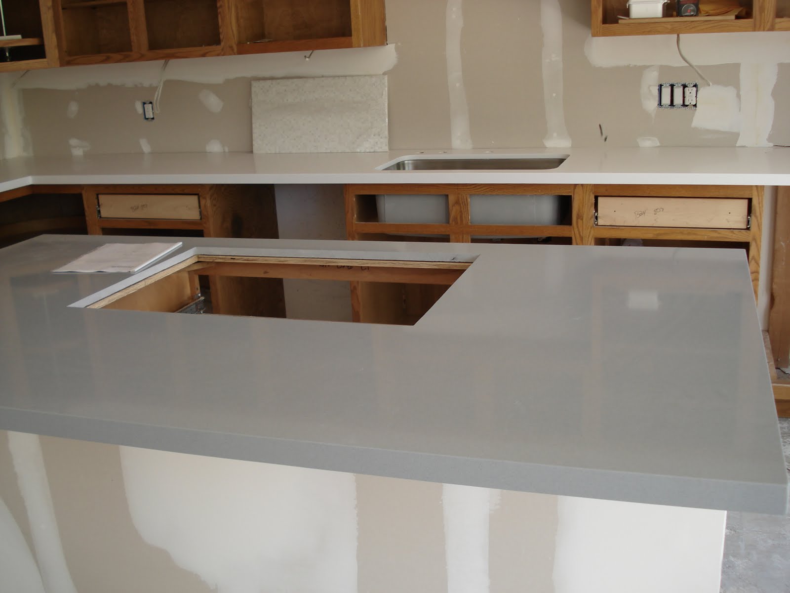
Kitchen by Eve Robinson Associates.  Another one of my favorites.  The white cabinets and white marble countertops are lovely yet predictable, but the custom desk and wallpapered walls and ceilings were excellent touches.  The backsplash is a back painted glass.  Back painted glass seems to be more widely used now and can be a nice infusion of modernity to an otherwise traditional style kitchen.


Volunteer Lounge by Brett Design.  More wallpapering and back painted glass.


Art Collector's Room by Aman and Carson


CoffinierKu Design.  Both Etienne Coffinier and Ed Ku were in the room when I walked in!  But I was too shy to say hello (me, shy?)

Dressing Room by Darren Henault

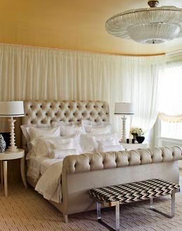
Master Bedroom by The Jeffrey Design Group.  This room irked me.  They had a velvet rope at the front door so I had to crane my neck into the room to view it.  It was a bit cold for my taste.


Entry by Katie Ridder

CoffinierKu Designs
Bathroom was lined with marble tiles that almost has that faux bois look to it, which I love.  The disappointment was the bathroom already looked like this pre showhouse and the homeowners wanted to keep the bathroom intact, so the designers just added hand blown glass bubbles and accessories.

All in all, I have to admit the designs in New York triumphed over the designs at the SF Decorator Showcase.  The main reason being, even the most minute details were not left out.  As they say, the devil is in the details.  However, some of the designs here are too conceptual.  One may ask, how do you bathe in a tub with glass balls already in it?  Whereas, the designs at the SF Decorator Showcase are more realistic for a real life family.

Monday, October 25, 2010

I'm back

Thank you so very much for patiently waiting with me as I marked the 13 weeks that slowly crept by as Bernhardt fabricated the Cal King headboard in North Carolina and then trucked it across the country.

But, alas, here it is:

I was still floored by how massive it was, even though I already knew the measurements. 

Here is how the headboard looks in the master bedroom:

I also have chosen the fabrics for the euro shams and the bedskirt.  Both fabrics are from Baker


Fabric for euro shams.  The blue ties in with the wall color and the damask print on the draperies.

Monday, August 9, 2010

Headboard

I was very pleased with how efficient I was over the weekend.  I got work done (day job that pays for all these projects), hung out with friends and family, cleaned the house and hmmm what else?  Oh yeah, I ordered my headboard!!!  I know, I know.  I was supposed to make my own to keep costs down.  However, I found everything I was looking for in this headboard for a little bit more than I would pay for materials to make my own.  Plus, I'm still exhausted from the whole electrical DIY weekend....

Anyhoo, here is the headboard that is very similar to the ones I was admiring in a previous posting:


I love the curves on this; isn't it so Moroccan?  There are two rows of brass nail heads for a little bit of a rustic feel to it and the very top of the headboard is a whopping 66 inches from the floor.  Talk about putting drama in a room!!!  The only disappointment is production time is approximately 12 weeks.


These are the sample upholstery I brought back with me.


I narrowed down to either the grayish blue velvet fabric or the woven golden beige fabric.  Let me tell you, how I loved the velvet one.  It definitely added glamour and the extra oomph to the room.  The woven fabric I liked very much as well.  It did have the casual element that I was looking for to tone down the room.  Being the good wife (and the fact that hubby could not have any input until now), I deferred to him to make the decision and he chose...


The woven fabric!  It would still be a great look in the room but I will probably incorporate the velvet fabric in the form of euro shams and bolsters.  Yes, plural.

Another item crossed off the checklist.

Thursday, August 5, 2010

Drapes are finally here...

Hey folks, I've been busy with the master bedroom redesign.  The drapes are in and here is a preview:


I can't open up the drapes for you to see yet as the pleats need a few days to set.  Next up, I have an idea to accent the headboard wall and will post a few samples to share with you.

See you soon.